
New Solutions for Sustainable Stormwater Management in Canada
A comprehensive publication for Sustainable Prosperity, designed to make complex policy accessible and overlooked infrastructure tangible.
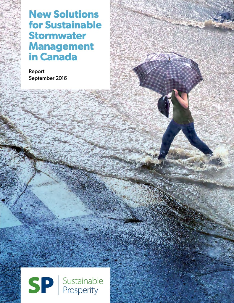
Starting with a supplied manuscript, logo, brand colours and font, I developed the full design of the 92-page publication, including photo selection and illustration. Photographs of rain, street runoff and everyday encounters with water gave readers familiar points of entry into a technical subject, drawing attention to infrastructure that people use constantly but rarely think about.
Colour linked section dividers, headings, tables, callouts and page-edge markers, helping readers locate themselves within the report. Full-page photography punctuated the detailed text, while consistent typography and clearly differentiated content types supported both sustained reading and consultation of individual sections.
Behind the layout, all content apart from the full-page section dividers was built into a single InDesign text flow, including illustrations, inline images and captions. This was particularly important for the extensive footnotes, whose references needed to remain coordinated as content moved between pages—even within tables and anchored text frames. To handle anchored footnotes that would not normally update automatically, I conceived and wrote a script that identified specially tagged frames and aligned their references throughout the document. Section boundaries still required manual attention during reflow, but this combination of document structure and scripting avoided constant footnote renumbering through revisions.
The report was delivered as a CMYK-optimized print edition and a digital edition with interactive indices and links, including footnote links, allowing readers to navigate directly between the report’s research, examples and sources.